
How to Improve Your YouTube Thumbnail Click-Through Rate
Key Takeaways
- 1
Thumbnail CTR (click-through rate) is the single metric that determines whether YouTube surfaces your video to more viewers — and most creators lose the click before the video even starts.
- 2
High-performing thumbnails use three concrete elements: a single focal point, a clear emotion or tension signal, and text of five words or fewer that creates an open loop.
- 3
Testing thumbnails systematically — not by instinct — is the only reliable path to lifting CTR, and tools like AskLibra surface which visual patterns your specific audience responds to.
- 4
Matching your thumbnail promise to your video's actual content protects your audience retention after the click, which the YouTube algorithm weighs equally alongside CTR.
What Is Thumbnail CTR and Why Does It Control Your Channel's Reach?
Thumbnail click-through rate (CTR) is the percentage of people who see your video's thumbnail and title in their feed and actually click on it. If your video is shown 10,000 times and 500 people click, your CTR is 5%. YouTube uses this number as a real-time signal to decide whether to keep showing your video to new viewers. A low CTR tells the algorithm your video is not worth promoting further. A high CTR tells it to accelerate distribution.
Most creators focus on scripting, editing, and SEO — and design thumbnails in the final ten minutes before uploading. That is the wrong order of operations. Your thumbnail is the first creative decision your audience makes about you, and it happens before they watch a single second of your content.
The Three Elements Every High-CTR Thumbnail Shares
1. A Single, Unambiguous Focal Point
Human eyes take less than 150 milliseconds to decide whether to keep looking at an image. Thumbnails with multiple competing subjects — two faces, a product, and background text all at once — force the eye to work too hard. The viewer moves on. High-CTR thumbnails give the eye exactly one place to land: a face with a clear expression, a single object with dramatic framing, or one bold visual element against a clean background.
When designing your thumbnail, ask: if someone saw this image blurred at 120 pixels wide, would they still understand what it is about? If the answer is no, simplify.
2. An Emotion or Tension Signal
Still images that convey motion, surprise, fear, or curiosity outperform neutral images on every channel category. This is not a stylistic preference — it reflects how the brain processes visual information. An image that signals unresolved tension (a shocked face, an unexpected juxtaposition, a before-and-after split) creates an open loop in the viewer's mind that can only be closed by clicking.
Real estate content, for example, consistently benefits from this principle. Thumbnails showing a dramatic property transformation — or a face reacting to a price — tend to generate strong engagement because the tension is immediately legible. Understanding What Is Engagement Rate on YouTube and What's a Good Benchmark? can help you measure whether your emotion signals are actually converting curiosity into watch time.
3. Five Words or Fewer of Thumbnail Text
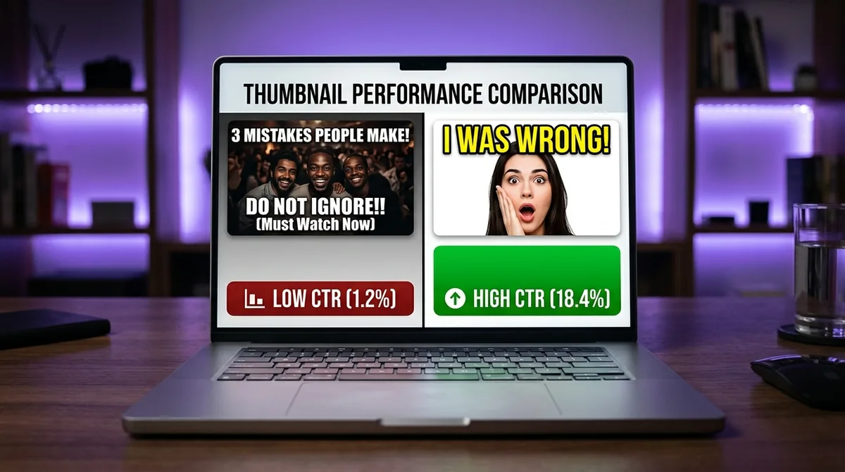
Thumbnail text is not a title. It is a visual element that should amplify the image's tension, not repeat the video title sitting directly below it. Five words is the practical upper limit before text becomes visual clutter. Three words is often better. The best thumbnail text creates an open loop: "I Was WRONG" or "They Lied" or "$0 to $10K" — short, specific, and incomplete enough to demand a click.
Avoid using full sentences, channel names, or episode numbers in thumbnail text. None of those elements increase CTR. They add noise.
Color, Contrast, and the Feed Environment
Your thumbnail does not live in isolation. It lives inside a grid of competing thumbnails, all fighting for the same eyeball. This means contrast — not just within your image, but against what typically surrounds it in your niche — is a strategic variable.
If every thumbnail in your category uses dark backgrounds and red text, a thumbnail with a white background and deep blue text will stand out. Study your top competitors' thumbnails as a group. Identify the dominant color palette and visual style of your niche. Then deliberately deviate from it in one or two controlled ways.
High-contrast color combinations (dark subject on light background, or a single bright accent color against a muted palette) perform well across mobile screens, where most YouTube views originate. Always preview your thumbnail at actual mobile scale — roughly 120 by 68 pixels — before publishing.
Face Thumbnails vs. No-Face Thumbnails: What the Data Actually Shows
The common advice to "always use your face" in thumbnails is an oversimplification. Face thumbnails perform well when the emotion on the face is unambiguous and directly connected to the video's core promise. A face staring blankly at the camera adds nothing. A face with a specific, readable expression — shock, joy, confusion, defiance — gives the viewer social information they can act on.
No-face thumbnails (product shots, data visualizations, before-and-after comparisons, dramatic scenes) can outperform face thumbnails when the subject itself carries the emotional weight. Tutorial and how-to content, in particular, often performs better with a clear "outcome" image — showing the finished result rather than the creator's face.
The honest answer is: test both for your specific audience. What works for a gaming channel will not work for a personal finance channel. Your channel's own data is the only reliable benchmark.
How to Test Thumbnails Systematically
Instinct-based thumbnail design produces inconsistent results. Systematic testing produces a library of knowledge about what your specific audience responds to. Here is a repeatable testing framework:
Step 1 — Define one variable per test. Change either the focal point, the emotion signal, the text, or the color palette. Never change all four at once or you will not know what drove the result.
Step 2 — Set a minimum impression threshold before judging. Do not evaluate a thumbnail's CTR after 200 impressions. Wait until you have at least 1,000 — preferably 5,000 — impressions from browse or suggested traffic before drawing conclusions. Browse and suggested traffic are the most useful sources for thumbnail testing because viewers in those contexts are choosing based almost entirely on the thumbnail and title, not a search query.
Step 3 — Document every test in a running log. Record the thumbnail variables, the traffic source, the CTR, and the average view duration. Over time, patterns emerge: maybe your audience responds to yellow backgrounds, or close-cropped faces, or text in the lower-left corner. These patterns become your channel's design system.
Tools like AskLibra analyze your historical video performance across 90 days to surface which content patterns are actually driving results on your specific channel. You can learn more about how that diagnostic works in How AskLibra's 90-Day Analysis Works — And What It Finds in Your Channel.
The CTR and Retention Trap — Why a High CTR Can Hurt You
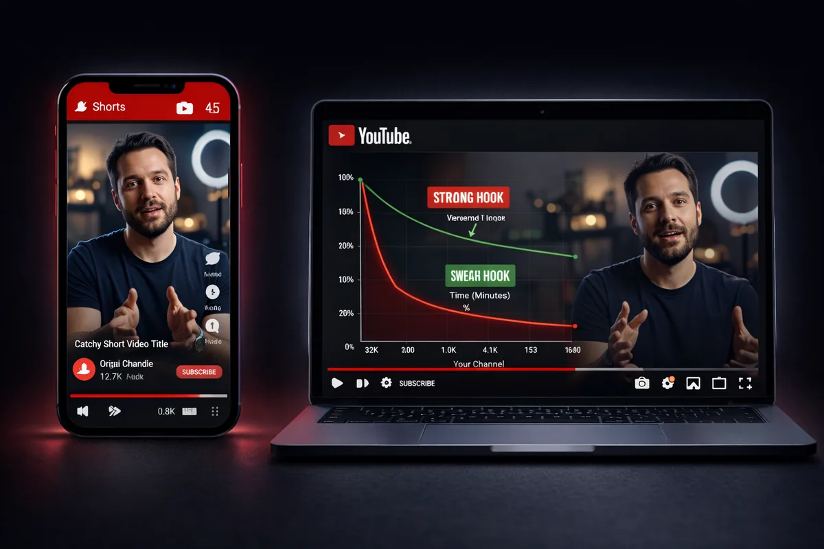
A thumbnail that is sensational enough to generate a 12% CTR but misrepresents the video's content will produce a steep drop in audience retention — the percentage of the video viewers actually watch. YouTube's algorithm measures both signals together. A video with high CTR and poor retention tells the algorithm that the thumbnail deceived viewers, and distribution is penalized accordingly.
This is why "clickbait" is a losing long-term strategy even when it works short-term. The sustainable version of a high-CTR thumbnail is one that creates genuine curiosity and then delivers on the implied promise in the first 30 seconds of the video. That connection between thumbnail promise and opening content is what What is a YouTube Hook and How Long Should It Be? covers in detail — the hook and the thumbnail must form a single coherent contract with the viewer.
Pairing Thumbnails With Titles for Maximum CTR
Thumbnails and titles are a unit. Neither works optimally without the other. The thumbnail creates the visual emotion; the title provides the cognitive specificity. Together they answer the viewer's unconscious question: "What is this, and why should I care right now?"
Avoid thumbnail text that duplicates the title word-for-word. The thumbnail text and the title should add information to each other, not repeat each other. A thumbnail showing a shocked face with the text "$847/month" pairs with a title like "I Replaced My Job Income With One YouTube Skill" — the thumbnail gives the concrete number, the title gives the context and stakes.
For a deeper framework on writing titles that do their half of this work, see How to Write a YouTube Video Title That Gets Clicked.
Building a Repeatable Thumbnail System
The highest-CTR channels do not design every thumbnail from scratch. They build a visual template — consistent layout, typography, and color logic — that viewers start to recognize as a brand signal. Recognition reduces friction. When a viewer sees your thumbnail style in a crowded feed, they already have a prior positive experience associated with that visual pattern.
Design two or three thumbnail templates for your main content categories. For example: one template for tutorial content (outcome image, no face, bold number), one for opinion content (face with strong expression, minimal text), one for data-driven content (chart or comparison visual, clear result text). Apply them consistently, test variations within the template, and update the template quarterly based on what your data shows.
If you want to integrate your thumbnail strategy into a broader content planning system, How to Build a Complete Content System Using AskLibra walks through how to connect your visual decisions to your posting schedule and video topic selection.
Frequently Asked Questions
What is a good CTR for YouTube thumbnails?
A CTR between 4% and 10% is considered healthy for most channels, though this varies significantly by niche, channel size, and traffic source. New channels often see higher CTR on smaller impression volumes because YouTube is testing the video with the creator's most loyal segment first. Benchmark your CTR against your own channel's historical average rather than industry-wide numbers, and prioritize improving it month over month.
How often should I update or change my thumbnails?
You can change a thumbnail on any existing video at any time, and YouTube will begin showing the new version immediately. If a video has plateaued in impressions, replacing the thumbnail is one of the fastest ways to re-enter algorithmic testing without publishing new content. Test one change at a time and wait at least two weeks before evaluating the impact on CTR.
Does thumbnail size or file format affect CTR?
YouTube recommends uploading thumbnails at 1280 by 720 pixels in JPG or PNG format, under 2MB. Uploading at this resolution ensures your thumbnail is crisp on high-density screens and does not appear pixelated on large monitors. File format does not affect CTR directly, but a blurry or compressed-looking thumbnail signals low production quality to viewers and will reduce clicks.
Should I A/B test thumbnails using YouTube's built-in tool?
YouTube offers a native test-and-compare feature for thumbnails in YouTube Studio, allowing you to run two thumbnail variants simultaneously and measure which generates higher CTR. This is the most controlled testing method available because both variants receive impressions under identical conditions. Use it whenever you have a genuine hypothesis about what variable is driving viewer decisions — not just to pick the one that "looks better."
Can the same thumbnail style work for both Shorts and long-form videos?
Shorts thumbnails display differently in the feed — they appear in a vertical crop rather than the standard 16:9 horizontal format — so a thumbnail optimized for long-form will often be cropped poorly in the Shorts shelf. Design separate thumbnail assets for each format, placing your focal point in the upper two-thirds of the frame for Shorts. For a framework on deciding which format to prioritize, see YouTube Shorts vs Long-Form: How to Decide What to Post.
Ready to see what the data says about your channel?
Stop guessing. Use AskLibra to get a personalized 90-day growth gameplan and find your perfect posting window.
No credit card required • Join 2,000+ creators